
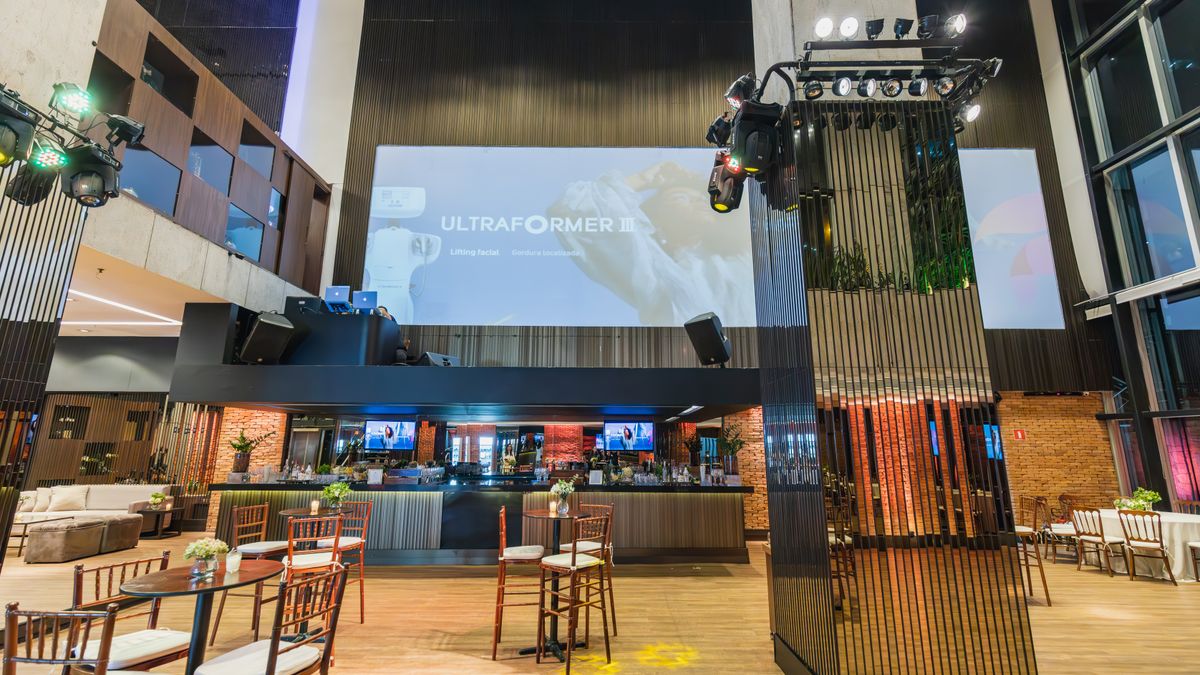
 On screen
A venue screen is not a billboard, a flyer or a social feed. People see it from a chair, a counter or a treadmill, usually while doing something else. Most digital signage ad design mistakes come from forgetting that, and they waste the seconds you paid for.
This post covers six common in-venue creative mistakes and how to fix each one. Every before-and-after is hypothetical, written to show the principle. It is craft advice, not a spec sheet, and no creative approach guarantees a result.
Why does venue creative fail?
CETV Now is a digital out-of-home (DOOH) network: video ads run on screens that venues already own, over live TV, in places like restaurants, dental offices, fitness facilities and dealerships. Your ad plays among sports, news and other programming, to people who are waiting, watching and deciding.
That setting rewards ads that are quick to read and easy to remember. It punishes ads that ask for effort. The mistakes below are all versions of asking too much from a viewer who gave you a glance.
Mistake 1: Too much text
Text too small on digital screens is the most visible version of this problem, but the root cause is too many words. If you shrink the type to fit a paragraph, nobody across the room can read it.
A useful rule is one idea per screen. If you have three ideas, you have three ads, or one ad now and another later. For more on turning a message into a short, screen-ready form, see how to design video ads for venue screens.
Mistake 2: A message that needs a lean-in
Some creative only works if the viewer moves closer, reads carefully or listens closely. In a busy lobby or dining room, that rarely happens. Background noise, conversation and distance all work against detail.
Design so the point survives a noisy room. Treat the picture and large on-screen words as the carrier, and treat anything spoken as a bonus. CETV Now has not published audio handling details in this post's source material, so ask the team how sound is treated before you build around it.
Mistake 3: No clear business name or next step
An ad can be well made and still do nothing if the viewer finishes it unsure who it was from or what to do. This happens often with brand-mood video: attractive footage, a logo for a split second, and no instruction.
Pick the next step that fits the setting. People in a waiting room can call, scan or remember a short name. People at a bar might simply need to know a place nearby is open late. Our post on designing a local offer ad goes deeper on making the offer itself clear.
Mistake 4: A long wind-up before the point
Many ads spend the first several seconds on a slow logo animation, a sweeping landscape or a setup line. On a screen where viewers glance in and out, the point may arrive after they have looked away.
Full-screen video on CETV Now runs as an unskippable takeover of the venue's live TV, and creative can be a 30-second video. Thirty seconds is enough time to make a point and repeat it, but not to waste the opening. Lead with the point, then use the remaining time to reinforce the name and next step. See ad formats for the options available.
Mistake 5: Low contrast and clutter
Light gray text on a photo, thin script fonts, and busy backgrounds look fine on a laptop and disappear on a TV across a room. Glare, viewing angle and distance all reduce legibility.
- Use a strong light-on-dark or dark-on-light pairing, and check it by squinting at the design.
- Choose heavy, plain typefaces over thin or decorative ones.
- Leave empty space around the key words; blank areas make the message easier to find.
- Cut decorative elements that do not carry meaning.
If you are choosing between a still design, motion graphics and full video, static vs. motion vs. video creative can help you decide which one suits your message.
Mistake 6: Ignoring the room
The same ad can fit one venue and clash in another. A loud, energetic spot may suit a gym front desk and feel out of place in a medical waiting room. A promotion for a lunch special does little at 9 p.m.
CETV Now targeting can be set by neighborhood, city, metro, zip code, vertical and individual venue, and layered with audience type and time of day. That gives you room to match creative to context, but the matching is up to you. Creative is also submitted for review before it runs, and placements run in curated venue categories to keep brands in appropriate contexts. If you advertise in a regulated category such as healthcare, financial services, alcohol or legal services, check your own compliance rules before you finalize the message. For preparation tips, read how to prepare creative for network review.
A one-minute review checklist
Before you submit, play the ad on a regular TV, stand across the room and run through these steps.
- 01
Count the ideas
If you can name more than one main message, split the ad or cut.
- 02
Read it from across the room
If anything is hard to read, make it larger or remove it.
- 03
Mute it
Check that the main point still comes through without sound.
- 04
Find the name and next step
The business name should appear early and late, with one clear action.
- 05
Check the first seconds
The point should appear at the start, not after a build-up.
- 06
Check the room
Ask whether the tone, offer and timing suit the venue category and time of day.
Once the creative holds up, you can plan where it runs. To start, you share your markets, venue categories, creative and budget, and CETV Now maps the plan to real-world audiences and provides a quote. Our campaign planning checklist covers the questions to settle first, and testing creative across venue categories shows how to compare versions without guessing.